Design > Color Theory — Part 1 of 3
There is a specific failure mode in how design students learn color, and I have watched it play out in classrooms for twenty-five years. They learn that red means passion, blue means trust, yellow means happiness, green means growth, and then they stop. They learn to justify a color choice by naming the association. They do not learn how to explain why a specific version of that color is not working. They cannot tell you why a dark, muted red communicates something completely different from a bright, vivid red, even though both are red. They cannot tell you why a palette with no fully saturated colors can still carry real emotional weight. They have learned one dimension of a three-dimensional system, and that single dimension is genuinely not enough to do the work.
I know this failure mode from the inside because I taught it for longer than I want to admit. I was doing what most color instruction does, starting with the wheel, covering the harmony types, talking about warm versus cool, covering the cultural associations, and calling it color theory. And my students could name colors and they could choose colors, but they could not engineer a specific emotional outcome through deliberate color decisions. They couldn’t say, in precise terms, what to adjust when a color wasn’t landing. Neither could I, not at first. It took a significant amount of reading and a willingness to admit I had been teaching an incomplete picture before I found the model that actually matches how color works.
Here is the model.
Any color you can actually see has three dimensions operating simultaneously. Not sequentially. All at once. The color is not first a hue and then a saturation and then a brightness. It is all three of those things at the same time, and the emotional content it carries is a function of all three, not just the hue. This is not a theoretical claim. It has been measured, repeatedly, in controlled studies with physiological indicators, skin conductance and heart rate, not just self-reported preference. Let me walk through each dimension.
Hue is the direction of the emotion. It tells you what kind of feeling a color is heading toward. The most intuitive way to think about it is temperature: warm colors on the red and orange and yellow side of the wheel tend to feel activating and attention-grabbing, and this is partly a physiological response because red measurably raises heart rate and skin conductance more than blue. Cool colors on the blue and green side tend to feel calmer and more receding. Hue also has cultural layers on top of the physiological ones, and those cultural associations are real and worth knowing. But hue is the starting point, not the complete picture.
Here is the important correction to standard teaching: yellow’s association with happiness is cultural, not physiological. In controlled laboratory settings, yellow and yellow-green consistently rate among the least pleasant hues. The happy-yellow connection is a learned Western cultural association. It is real in that context. It is not a built-in perceptual response. If you are working across cultures, this distinction matters significantly.
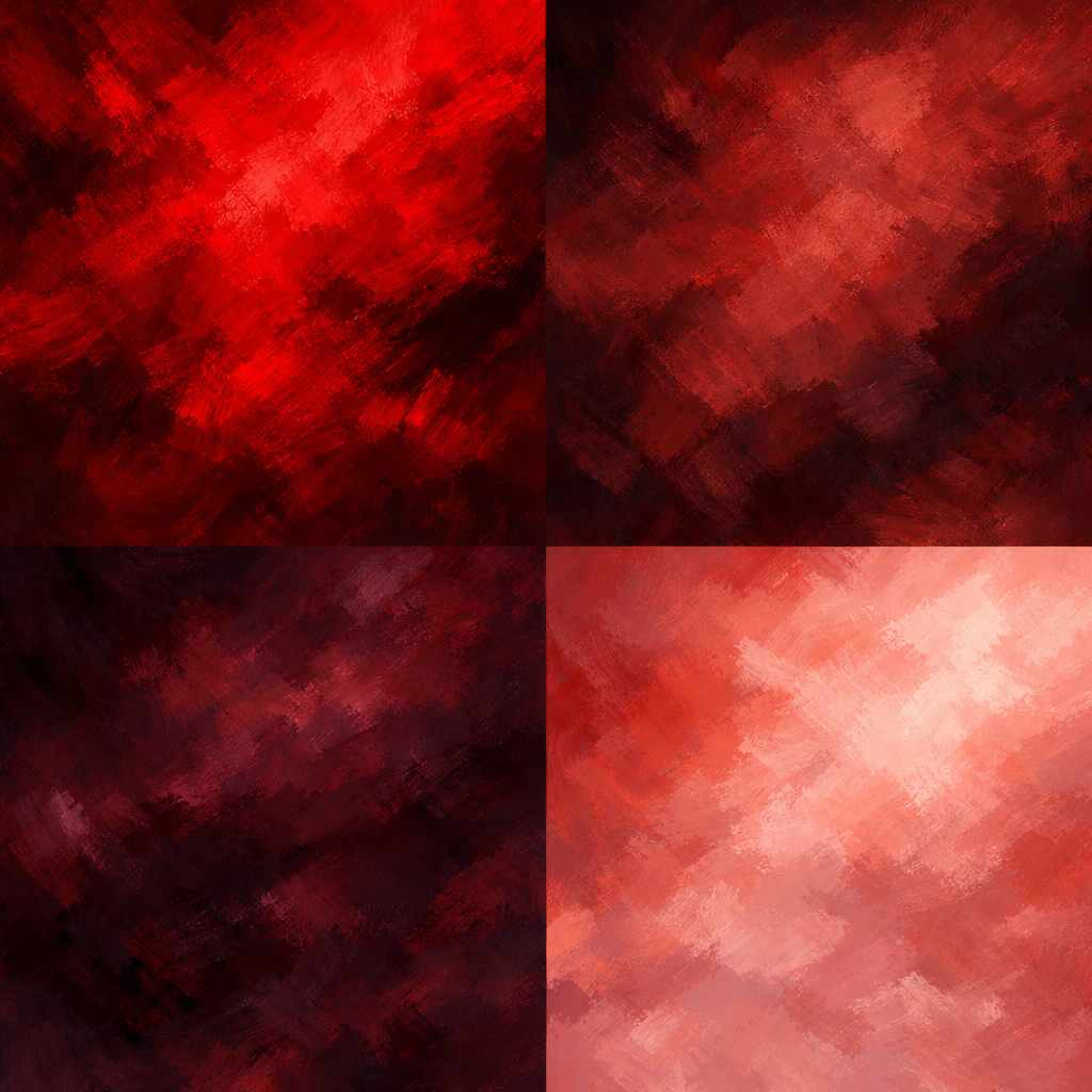
Saturation is the volume dial. It controls how intense or muted a color appears, which is the same as controlling how loudly it communicates emotionally. A fully saturated red demands attention. A desaturated version of the same red, a muted brick or a dusty rose, says something quieter and softer, even though the hue has not moved at all. The research shows that saturation is actually a stronger driver of emotional intensity than hue. The difference between pink and red is not just that one looks more red. It is a measurable difference in how strongly the color activates a physiological response. Turn up the saturation, you turn up the emotional volume. Turn it down, you lower it.
There is a ceiling here worth knowing. Extreme saturation can tip from activating into overwhelming. Maximum saturation is not maximum effectiveness. It is more like distortion on a speaker. The goal is calibration, not just intensity.
Brightness is the weight dial. It determines how light or heavy a color feels, which translates directly into how approachable or authoritative it reads. High brightness feels fresh and approachable and easy. Low brightness reads as weighty and serious and commanding. The research is precise about this: brightness is the single strongest predictor of how pleasant a color feels. This is why deep burgundy and pale pink can both be called red and yet communicate almost nothing in common. The hue is similar. Everything else, the brightness and the saturation, has shifted, and those shifts carry most of the emotional meaning.
A designer who thinks only in hue cannot explain the difference between those two reds. A designer who understands all three dimensions can say: same hue, but the burgundy has low brightness and moderate saturation, so it reads as authoritative and refined and a little serious; the pink has high brightness and low saturation, so it reads as soft and approachable and a little playful. Those are specific descriptions. You can design with them. You can fix a palette using them.
The practical implication of all this is that the right question when evaluating a color is never just “what does this color mean?” The right question is: what does this hue, at this saturation level, at this brightness level, actually communicate in this context? That is a more demanding question, and it is the only one with a reliable, actionable answer.
In the next post I want to show you how this three-dimensional model connects to something most designers already know, a framework that has been sitting right in front of us the whole time, waiting to be applied to color.
This is part one of a three-part series on color theory and design. Part two: how the CRAP principles explain every color harmony that has ever existed.
Category: Design > Color Theory
For Further Reading
Explore these resources for deeper context on the ideas in this post.
- Using Color to Enhance Your Design (NN/g) — Color harmony and application in design
- CSS Color Module Level 4 (W3C) — OKLCH and modern color space specifications
- The Power of The Palette (Adobe Blog) — Hue, saturation, brightness dimensions