For twenty-five years, I taught color theory the way I learned it. Red means passion, blue means trust, yellow means optimism. I had students make color associations, build mood boards, create palettes based on emotional meanings. And it worked, sort of. Students learned to use color. They got competent. But they were still operating on associations, on metaphor, on the cultural inheritance of what colors “mean.”
What bothered me was that I was ignoring the physics. Color is not a metaphor. It’s electromagnetic frequency. Violet sits around 750 terahertz. Red sits around 430 terahertz. This is not analogy. This is measured, observable reality. Light itself is vibration, and different frequencies of vibration produce different colors. So why was I teaching color as if it were purely cultural, purely learned, purely associative?
That question led me to the research, and the research changed everything.
A meta-analysis published in 2025 looked at 132 studies across 64 countries, with 42,266 participants total. The findings were clear: color-emotion correspondences transcend cultural boundaries. People from vastly different cultures, with different languages and different traditions, make similar emotional associations with colors. That consistency doesn’t come from culture. It comes from something deeper. It comes from the way human neurology responds to different frequencies of light.
But here’s where it gets interesting. Much of what we think we know about color is wrong, or at least incomplete.
Take yellow and happiness. That’s one of the strongest color-emotion associations in the cultural record. Yellow means happiness, optimism, joy. Except in the lab, where yellow-green consistently rates among the least pleasant hues people can perceive. The association with happiness is cultural, not physiological. In a controlled setting where people are just rating the pleasantness of colors without any cultural context priming them, yellow-green doesn’t trigger happiness. It triggers something closer to unease. This matters because it means your cultural training is overriding your actual neurological response to that frequency.
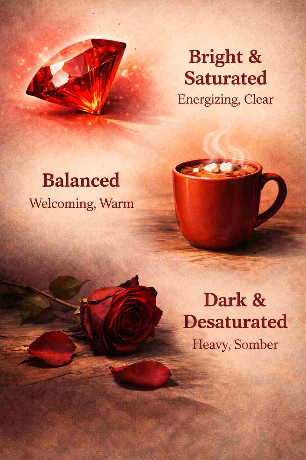
What actually predicts how pleasant a color feels? Brightness. That’s the single strongest predictor. Brighter colors feel more pleasant than darker colors, regardless of hue. This is physiologically grounded. Brightness is literally how much light is hitting the eye, and the human nervous system has evolved to prefer higher light frequencies. It signals safety, visibility, clarity.
The second predictor is saturation. Saturation drives emotional intensity more than hue does. A highly saturated red is more emotionally intense than a desaturated red, even though both are red. This matters because it means you’ve been making decisions about intensity without consciously understanding what creates intensity. This makes sense from a frequency perspective: saturation is the purity of the signal. A saturated color is a clean, unambiguous frequency. A desaturated color is that frequency mixed with gray, muddied, less direct. When you desaturate a color, you’re literally diluting its signal strength, and the human nervous system reads that as less intense, less important, less clear.
So when you’re designing, here’s what changes. You stop asking “what does this color mean?” That’s the wrong question, and it locks you into cultural associations that might not serve your actual message. You start asking “what does this hue, at this saturation, at this brightness, actually communicate?” These are different questions. Only the second one has a reliable answer.
If you want to communicate clarity and visibility, you need brightness. If you want emotional intensity, you need saturation. If you want the color to feel warm or cool, you’re working with hue, but hue matters less than you think. The frequency of that color, measured as brightness and saturation, is doing more work than the color name itself.
This is why a desaturated, dark blue can feel depressing, even though blue is supposed to mean trust and calm. The low brightness and low saturation are overriding what the hue is supposed to communicate. The frequency is muted. It’s weak. And your nervous system knows it.
Conversely, a highly saturated, bright blue feels energizing and clear, even though blue is supposedly the calming color. The frequency is clean and strong. Your eye receives it without having to work to decode a muddy signal.
Here’s the practical implication that changes everything. You can now stop relying on color associations and start working with color as frequency. You can ask questions like: Does this palette have enough brightness to feel energized? Is the saturation level supporting the emotional intensity I need? Are these hues supporting each other in a coherent frequency band, or are they creating discord? These are measurable, defendable, science-backed questions. You can justify your color choices to a client using actual principles, not just “it feels right.”
Color is electromagnetic frequency. That’s not poetic. That’s physics. And once you start thinking about color that way, you stop choosing colors because they fit a mood board. You choose them because they’re the right frequency for the message you’re sending. You choose them because they’ll create the neurological response you actually want in your audience. And that’s when your work stops being based on intuition or training and starts being based on understanding how light, frequency, and the human nervous system actually work together.
This is not a small shift. This is the difference between designing by association and designing by knowledge. Between hoping your choices are right and knowing they’re right. Between teaching students to follow rules and teaching them to understand the principles beneath the rules. When you teach color as frequency, you’re giving them access to principles that work across contexts, across cultures, across time. You’re not training them in taste. You’re training them in physics.
The implications spread further than just color choice. Understanding that color is frequency changes how you think about contrast, about visual weight, about how much a color can carry in a hierarchy. It changes how you approach accessibility, because brightness and saturation are measurable, not subjective. It changes how you defend your work, because you can point to research, not just to preference. Color is frequency. Once you accept that, everything changes. Your teaching changes. Your practice changes. Your ability to make intentional, defensible, research-backed choices emerges. And that’s when color stops being one of the hardest design choices to justify and becomes one of the easiest, because you finally understand what’s actually happening when light hits the eye.
For Further Reading
Explore these resources for deeper context on the ideas in this post.
- Using Color to Enhance Your Design (NN/g) — Practical color theory in design
- How Do We See Color? (Pantone) — Color perception and visual mechanisms
- What is Color Theory? (IxDF) — Color science fundamentals