I was stuck. Completely stuck. This was ten years ago, maybe longer. I had a design brief in front of me that someone had written in the standard way: “We need something that feels sophisticated but approachable. Modern but warm. Confident yet welcoming.” You’ve seen a hundred briefs like this. I’d written a hundred briefs like this.
The problem wasn’t the language. It was that I was describing what the image should show, not what it should feel like. I was naming colors and listing compositional elements, but I wasn’t accessing the frequency beneath those choices. I was designing by adjectives instead of by vibration.
Then the question arrived, and it came from nowhere: what if instead of describing the image, I described the music?
That’s where the Visual Symphony Composer methodology came from. And it changed everything about how I approach a brief. What I discovered was that music had structure that design briefs didn’t. Music had a language for emotional content that existed independent of visual form. And if I could borrow that language, I could get to the frequency beneath the surface. I could describe what something needed to feel like before I described what it needed to look like.
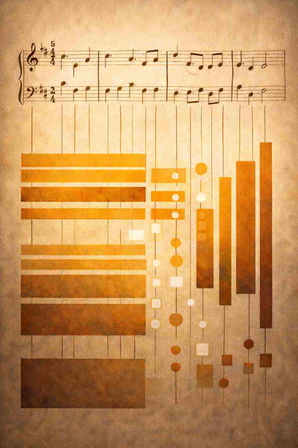
Here’s how it works. A symphony begins with two decisions, not thirty. The composer chooses a key, which establishes the emotional tonal center. E major feels wistful and sun-aged. C minor feels introspective and minor-key serious. Then comes the time signature: the rhythmic feel. Four-four is grounded and steady. Three-four is waltz-like, almost delicate. These two choices don’t describe the symphony; they are the symphony. They are its skeleton and its heartbeat. Everything else in the composition serves these two foundational decisions.
Then the composer chooses instrumentation. The strings provide sustained warmth and continuity, so they become your color relationships, your tonal foundation. The woodwinds are bright and melodic, with personality. They become your typography and your focal points. The brass is powerful and ceremonial, cutting through everything else. That’s your contrast and structural weight. Percussion handles the rhythm, the pulse, the space between notes. That’s your negative space and your grid structure. And dynamics, the rise and fall of volume, that’s your visual hierarchy.
This isn’t metaphor. It’s a structured application of cross-modal correspondence theory to the way you think about a design.
I tested this with “A Pirate Looks at Forty” by Jimmy Buffett. Unusual choice, maybe, but the song was always intriguing to me because it felt like it was designed. The key is E major with a bluesy inflection, and the time signature is four-four, but played languid and slow. That established something immediately: wistful, sun-aged, retrospective. Not eager. Not sharp. Weathered and reflective.
The guitar warmth defined the color palette direction, and I knew before I picked a single hex code that I needed warm tones, slightly faded, saturated without being vivid. Earthy. The harmonica came in as the emotional voice, and that told me the typography needed to be clear, direct, honest, working-class honest. No flourish. No pretense. And the percussion, minimal and unhurried, told me to use generous negative space, to let compositions breathe, to structure things with restraint.
When I built the design brief from that music, it was radically different from the one I’d started with. I had architecture instead of wishes. I had frequency instead of adjectives. And the client got a design that felt like it had been composed, not assembled.
The breakthrough is this: when you describe a visual through the logic of another sensory domain, you bypass the naming problem entirely. You stop asking “what should this look like?” and you start asking “what should this feel like in time, in rhythm, in the way sensation unfolds?” A photograph has no time dimension until you apply musical thinking to it. A logo is just pixels until you understand what key it sits in. But the moment you ask “what symphony is this?”, everything clarifies.
Your brief changes. Your team discussions change. You’re no longer picking colors from a list because you think they’re sophisticated. You’re choosing hues that belong to a key signature you’ve already established. You’re no longer deciding whether something is too bold or too subtle through vague discussion. You’re tuning an instrument. You’re balancing the frequencies that your audience is going to feel without knowing they’re feeling them. Every choice has a musical reason.
When I came back to that original brief and rewrote it using the Visual Symphony Composer method, it wasn’t longer. It was different. It had backbone. It had logic. Instead of “sophisticated but approachable,” I had “E major, four-four, languid pacing.” Instead of lists of adjectives, I had instrumental assignments. Brass would carry the authority. Strings would create continuity. Woodwinds would provide the human voice. That meant contrast had to be structural, not accidental. Color needed to support harmonic relationships, not just aesthetic preference. Typography needed acoustic integrity, not just visual polish.
This is what the Visual Symphony Composer does. It takes the structure of music, which humans understand viscerally even if they don’t think they do, and it lets you apply that structure to visual design. You arrive at frequency-level correspondences that a conventional brief would never surface. And your design becomes something that doesn’t just look right; it resonates. It feels like it was always supposed to be that way. Like a song that was written, not for the ear, but for the eye. Like someone composed it with intention, not assembled it with hope.
For Further Reading
Explore these resources for deeper context on the ideas in this post.
- How to Use Color Theory to Enhance Your Designs (IxDF) — Cross-modal color and emotion relationships
- The Tone of Typography: A Visual Communication Guide (IxDF) — Typography conveying emotion and tone