A student asked me something years ago that I should have been able to answer but couldn’t. Two typefaces, completely different in appearance, somehow had the same emotional register. One was angular and geometric, the other was rounded and organic. They looked nothing alike. But when I placed them in the same layout, they felt like they belonged together. The student wanted to know why. I didn’t have a good answer then. I just said something about intuition or training or “it’s one of those things you learn over time.”
It bothered me. So I started digging into phonosemantics.
Phonosemantics is the study of sound-meaning relationships, and it’s rigorous science. It turns out that round vowels, the ones you shape with your lips in a rounded position, and voiced consonants (the ones you feel vibrate in your throat while you say them) produce lower, more sustained frequency profiles. These are the profiles of softness, weight, safety. The word “moon” sounds like what it means. Sharp fricatives (sounds like “s” and “f”) and voiceless stops produce higher, more discontinuous frequency profiles. These are the profiles of urgency, precision, cutting through. The word “sharp” sounds like what it is.
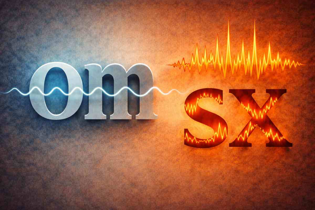
Here’s the part that changes everything: typography extends this. A typeface with sharp terminals, high x-height contrast, and tight tracking creates a visual frequency pattern that echoes the acoustic properties of high-frequency sounds. The letter forms themselves are like the speech sounds they represent. When you type the word in that typeface, you’re amplifying a frequency that was already embedded in the sound of the word itself.
A rounded typeface with generous spacing and low contrast creates the visual equivalent of low-frequency sustained tones. It’s safe. It’s continuous. It doesn’t cut. Put the word “smooth” in a rounded, generously-spaced font, and you’re not just saying smooth; you’re making smooth visible. You’re translating the acoustic profile of the word into visual form, and the form matches the sound’s frequency structure.
This is not metaphor. It’s measurable.
The research on this is extensive. Studies have shown that people consistently associate certain phonetic patterns with emotional qualities, and these associations hold across languages and cultures. Front vowels like “i” and “e” associate with smallness, brightness, positivity. Back vowels like “u” and “o” associate with darkness, heaviness, negativity. This wasn’t learned. It appears in infants as young as four months old. It’s pre-linguistic. It’s built into how human brains process sound and meaning.
Now extend that to visual form. When you choose a typeface, you’re either reinforcing that acoustic profile or creating dissonance. A typeface with tight spacing and sharp terminals next to large, rounded, generously-spaced forms creates friction. Not always bad friction, but friction nonetheless. Your eye sees the contradiction before your brain consciously registers it.
This is why a typeface can feel “right” or “wrong” for a project even before you read a single word. Your visual and acoustic processing systems are already in conversation. They’re checking whether the form matches the frequency. Whether the sound and the shape are aligned. And when they don’t match, your audience experiences that misalignment as tension, even though they don’t consciously know why the design feels slightly off.
So here’s what changes in practice. You stop asking “does this typeface look good?” That’s the wrong question, and it’s vague. You start asking “what does this typeface sound like?” What frequency profile does it embody? Is that the frequency your message needs to carry? If you’re designing something that needs to feel urgent and precise, and you choose a typeface with thick terminals and generous spacing, you’ve created a contradiction that your audience will feel in their nervous system, even if they can’t name it. The visual form is contradicting the acoustic information embedded in the words themselves.
A typeface with sharp terminals, high contrast, tight tracking, and angular letterforms has a high-frequency acoustic profile. It’s the visual equivalent of a sharp fricative, a cutting consonant. It cuts through. It attracts attention. It feels precise and modern and sometimes cold.
A typeface with rounded terminals, low contrast, generous tracking, and flowing letterforms has a low-frequency, sustained acoustic profile. It’s soft. It’s continuous. It feels welcoming and warm and sometimes dated, depending on how rounded it gets.
Neither is better. But they’re not interchangeable either. They’re different frequencies. And now you have a framework to articulate why a typeface works or doesn’t work, using a language that connects form to sound to emotion to perception. You can tell a client, with confidence backed by research, why their typeface choice matters beyond aesthetics. You can explain that typography is acoustic design. That every letter is a frequency. That when you choose a typeface, you’re choosing what the words will sound like when people read them with their eyes.
That’s the power of understanding phonosemantics. You’re not just picking pretty shapes anymore. You’re selecting instruments. You’re tuning the voice of your message. And that voice will either resonate with your audience or create static, depending on whether you’ve matched the frequency to the message.
Now you can do that intentionally. That’s the power of understanding phonosemantics in the context of design. You’re not operating on intuition anymore. You’re operating on the intersection of acoustic science, visual form, and neurology. You understand that the words you’re setting in type already carry frequency information, and the typeface you choose either reinforces that frequency or creates static. You can make that choice deliberately, with full knowledge of what you’re doing and why it matters. You can teach it to students. You can defend it to clients. You can build a design practice on actual understanding instead of on taste and tradition.
For Further Reading
Explore these resources for deeper context on the ideas in this post.
- Legibility, Readability, and Comprehension (NN/g) — Foundational typography research
- The Tone of Typography: A Visual Communication Guide (IxDF) — Typography as emotional communication
- Thinking in Type: The Practical Philosophy of Typography (TDC) — Philosophical approach to typographic design